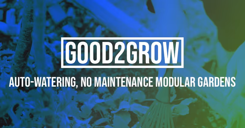
Good 2 Grow
Client Good 2 Grow
Services Brand Identity, Print Design, Digital Marketing, Marketing Collateral, Social Media Assets
The Starting Point
Good 2 Grow came to us at a point where they were growing faster than their brand could keep up. They had a name people liked and a product people responded to, but visually it was all over the place. Print pieces were designed one-off by whoever was available. Digital ads were thrown together in Canva with no guidelines. Social media posts changed style every week depending on who was posting.
The result was a brand that didn’t feel like one. Every touchpoint looked like it came from a different company, and that inconsistency was costing them trust with potential customers who couldn’t get a read on who they were.
Building the Brand Foundation
We started where it matters — the identity itself. Logo refinement, a defined color palette, typography selections, and a visual language that could stretch across formats without falling apart. The goal wasn’t to reinvent them. It was to take what was already working about their personality and give it structure.
We documented everything in a brand guide their team could actually use. Not a 60-page PDF that sits in a drawer — a practical reference with clear rules, examples, and enough flexibility to keep things from feeling rigid.
Print That Holds Up
For a business that still relies heavily on in-person touchpoints, print matters. We designed brochures, flyers, event handouts, and leave-behinds that all pull from the same visual system. Each piece works on its own but clearly belongs to the same family.
Paper stock, finishes, and production specs were all considered up front so nothing got lost in translation between screen and print. What the team approved in a proof is what showed up in the box.
Digital Marketing Materials
We built a full suite of digital assets — web banners, email headers, digital ad templates across standard sizes, and landing page graphics. Everything was templatized so their marketing team could swap copy and images without breaking the layout or drifting off brand.
The ad templates alone saved them hours per campaign. Instead of starting from scratch every time, they had a system that made execution fast and consistent.
Social Media Kit
Social was where the inconsistency had been most visible, so we gave it special attention. We delivered a content kit with post templates, story formats, highlight covers, and a set of guidelines for photography style, caption tone, and hashtag usage.
The kit was designed for their team to run with day-to-day without needing a designer in the room. Constraints that feel like freedom — that was the goal.
What Changed
After rollout, Good 2 Grow’s presence tightened up fast. Campaigns started looking like they came from the same place. Their team moved quicker because the decisions were already made — just execute. Engagement climbed because people could finally recognize the brand at a glance, whether it was a flyer on a bulletin board or a sponsored post in their feed.
The work up close
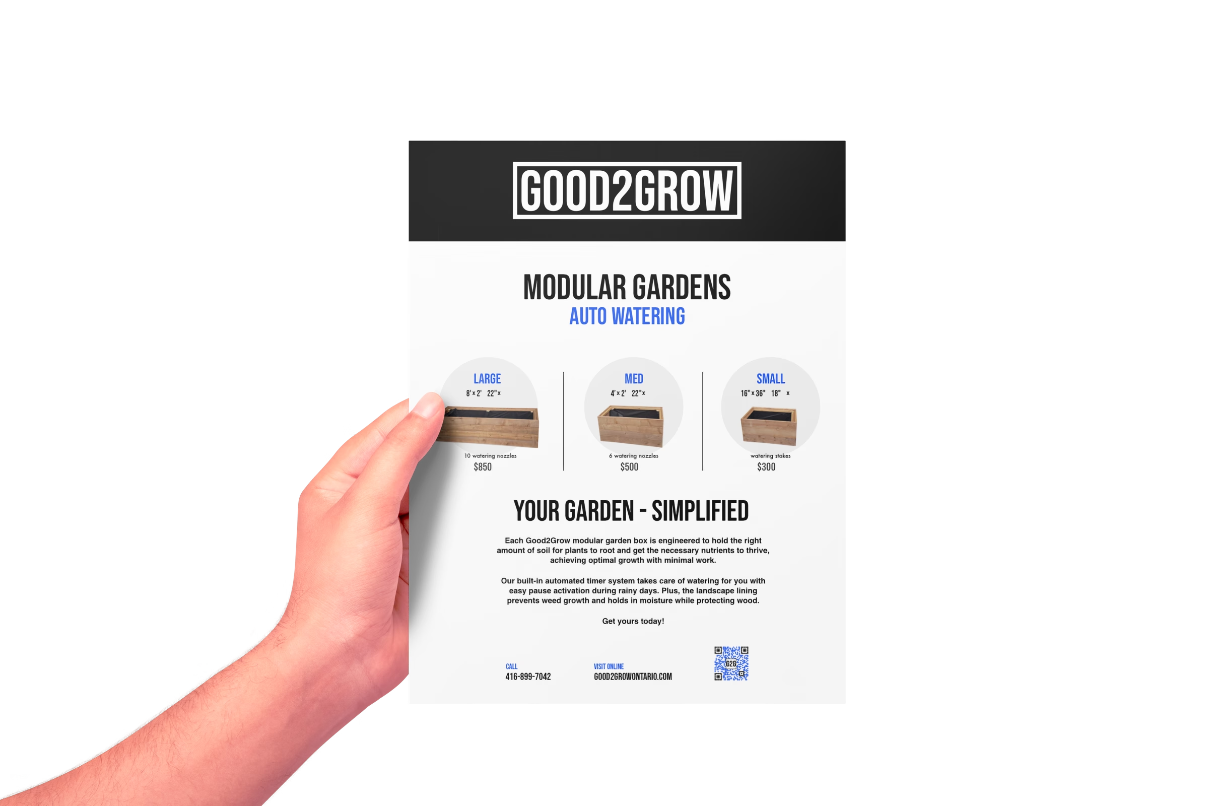
Product flyer — modular gardens lineup
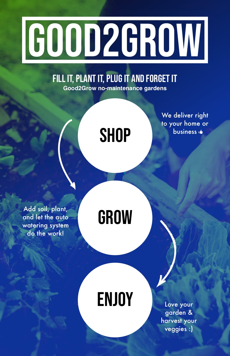
Flyer back — shop, grow, enjoy
Results
0%Increase in Brand Recognition
0+Marketing Assets Delivered
0Channels Unified
0%Boost in Engagement