Earthling Hair Studios
Client Earthling Hair Studios
Services Logo Design, Brand Identity, Signage, Business Cards, Product Packaging, Print Collateral
A Studio With Heart, Missing Its Look
Earthling Hair Studios has been a neighborhood staple for years. Walk in and you get it — the vibe is warm, down-to-earth, and genuinely community-driven. But none of that was coming through in the visual presentation. The sign outside was faded and generic. Business cards were printed from a template. Product bottles on the shelves had handwritten labels. It worked when they were just getting started, but the studio had outgrown it.
They came to us wanting everything to feel intentional. Not corporate, not trendy for the sake of it — just a real identity that matched the care they put into their work.
Starting With the Logo
We explored directions that leaned into the name. “Earthling” has a grounded, organic quality to it, and the logo needed to reflect that without going full cliché with leaves and earth tones. The final mark is clean and versatile — it works on a storefront sign, shrinks down to a business card, and embosses onto a product label without losing legibility.
We developed a primary lockup, a stacked version, and a standalone icon for use on smaller formats. A flexible system, not a single static image.
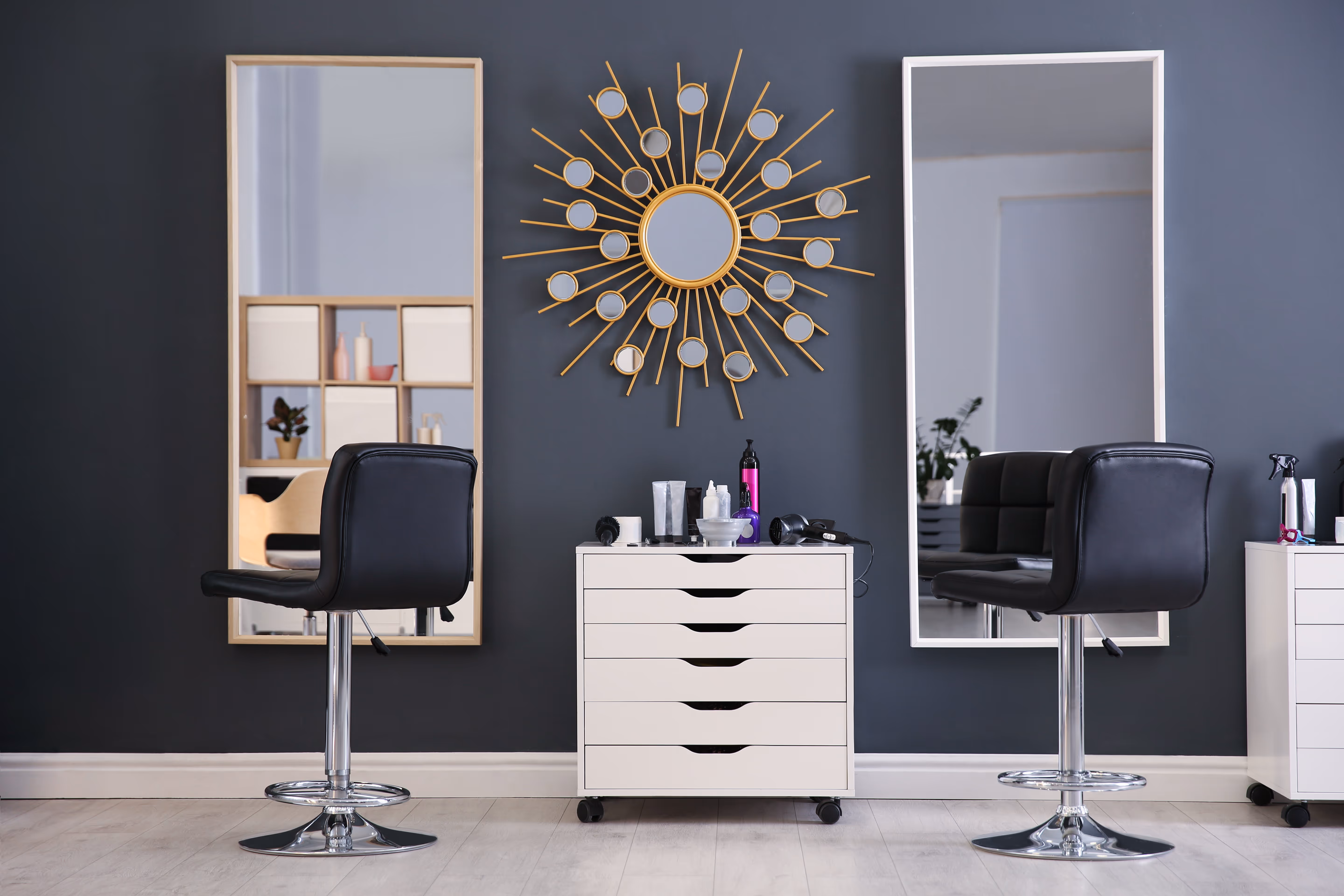
Signage That Sets the Tone
The exterior sign is often the first brand impression, and for a local business on a busy street, it matters. We designed signage that’s visible, inviting, and consistent with the rest of the identity. The materials and finish were chosen to hold up over time and look good in both daylight and under evening lighting.
Business Cards Worth Keeping
We designed cards with a soft-touch matte finish and a layout that gives the brand room to breathe. Contact details are clear, the logo sits prominently, and there’s enough personality in the design that clients actually hold onto them. For a community business that thrives on word of mouth, that’s the point.
Product Bottles on Brand
Earthling carries their own line of hair products, and the bottles needed labels that matched the studio’s identity. We designed a label system that works across different bottle shapes and sizes, with clear product naming, ingredient callouts, and a consistent visual language. The shelf behind the chair went from looking like a supply closet to looking like a curated product line.
The Cover Sheet
This one might seem small, but it’s the most personal touchpoint in the whole system. The cover sheet is what clients sit under for the duration of their visit. We designed a branded cape with a subtle logo placement and a fabric choice that feels premium without being flashy. It’s a detail most studios never think about, and it ties the whole experience together.
How It All Came Together
Every piece reinforces the same identity. A client sees the sign, walks in, sits under the branded cover, gets their hair done surrounded by matching product bottles, and leaves with a business card that looks like it belongs to the same place. That consistency didn’t exist before. Now it does, and the studio finally looks as intentional as the work they do inside it.
The work up close

Exterior storefront signage
Business cards — front and back

Custom product bottle labels

Branded client cover sheet
Results
0Brand Touchpoints Designed
0%Increase in New Clients
0%Brand Consistency Score
0Product Lines Labeled